
Friday 20 December 2013


Monday 16 December 2013
Time Management Update
Currently, I am on track with my original time management plan. I intend to stay this way until the end of the course.
Production: Audience Feedback
Here is my audience feedback. I chose people that I thought represented my potential readership quite well. Both of the interviewees are within my target age rage, and I have used both genders, as my readership would most likely be a mix of the two.
From this, I can take ideas on how to improve my current pages. Firstly, it has been suggested that I lower the price of my magazine. This will be easy enough to do this, as the only place where this is shown is on the barcode. Also, my audience feedback told me that the red text atop the black background is sometimes difficult to read when the text is smaller. I will experiment with colours, effects, font size and backgrounds to eradicate this issue. Other than this, my target audience seem pretty pleased with my magazine pages.
Wednesday 11 December 2013
Production: Audience Feedback Questions
These are the questions that I will ask my target audience to improve my magazine.
- What do you think of the layout of my magazine cover? How could it be improved?
- What do you think of the £2.10 price for 45 pages? Too high? Too low? Just right?
- What do you think is missing from my contents page?
- What is your opinion on the red borders on the images on my contents page?
- Are all the fonts clear and easy to read, in your opinion? Suggest improvements.
- Any other comments?
Production: First Double Page Spread
This is my first cover. I will improve this after my audience feedback. Please see earlier post to see how I constructed this.


Production: First Contents Page
This is my first cover. I will improve this after my audience feedback. Please see earlier post to see how I constructed this.

Production: First Cover
This is my first cover. I will improve this after my audience feedback. Please see earlier post to see how I constructed this.

Monday 9 December 2013
Sunday 8 December 2013


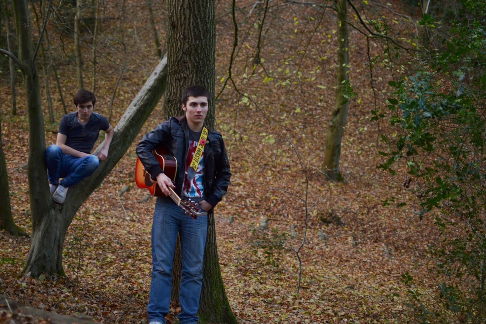


Production: Photo Shoot
Here is the contact sheet from my photo shoot with Dan and Alex. For this shoot, I kept the aperture at f/1.8. This is because, not only did it help my get the required amount of light with a quicker shutter speed, but it also makes the depth of field shallower, giving the image a more intimate feel. These images were shot at 'golden hour' (pre-sunset), to give them interesting lighting. I used my Nikon D3100 DSLR and my Nikkor 35mm f/1.8G lens for this shoot.


Sunday 1 December 2013
Time Management Update
I am currently mostly on track with my original time management plan, however, a few things have fallen behind. I have not currently managed to collect any images, as my intended models have been very busy and the weather has been poor, and I have only got audience pith feedback from one person, as I haven't been able to get anyone else. I intend to have both of these things done by the end of this week.
Sunday 17 November 2013
Photo Shoot Ideas: Clothing


These are my initial clothing ideas for my shoot with twin musicians, Dan and Alex. I decided to dress them in similar clothing with slight differences, to connote unity, whilst still giving each boy his own identity. This will be appealing to my individualist target audience who, themselves, like the emphasize unique features of each person.
The image on the left shows my idea for Alex. This includes a long sleeved black hoodie/jumper with straight cut denim jeans. Whereas, in my panned clothing for Dan (right) I have included a black tshirt and denim skinny jeans. This will hopefully look really effective with the location I have planned. This is due to the dark clothing (which I have noticed is a trait of portraits in rock music magazines) contrasting with the greenery and colours of the town, which I intend to include in the background.
Photo Shoot Ideas: Location
I intend to use a similar location to the image shown below for my cover shoot. This is a photograph that I took overlooking my home town. A location similar to this would be ideal for my central image on my magazine, as it connotes a homely feel, which works really well when featuring unsigned artists.

Photo Shoot Ideas: Inspiration
In over 3 years of reading Kerrang! magazine there is one main photo shoot that sticks in my head the most, and that is the 'Rebirth of British Rock' shoot with Rise To Remain, and specifically the image below. This is the most iconic image in my mind. The location plays a big part in the appeal of this image. By placing the band on a helipad on top of a skyscraper in the middle of London not only give the image a gorgeous, abstract backdrop, but also relates back to the article, by including iconic London landmarks (the gherkin, St. Paul's Cathedral, etc.) to signify England. I also love how the band have been dressed in black, so they blend into the roof top, which emphasizes the skyline. The band seem very unposed, which connotes the wild, carefree style of their music. If I can create an image with this amount of power, I will certainly use it on my double page spread.

The below image is a spectacular example of live music photography, and connotes well the fun, lively performance style of the featured band. I think incorporating this live style into my staged photo shoot will be a great way to differentiate my unsigned magazine from the typical rock magazine.

Photo Shoot Ideas: Models
In this post I expressed my initial ideas for subjects of the photographs that I will use in my magazine. All of the images here I have taken myself, which gives me a good insight in the way they might look if I were too do a shoot with them.


Dan and Alex
Dan and Alex are in their own unsigned band anyway, so it would not be difficult to make them seem fitting for my magazine. Also, being twins, they have the best possible chemistry, meaning they will look less awkward, and far more natural when being photographed. By using male models for my sub-genre of magazine, I will attract a larger readership, not only because my predominately male readers will find it relatable, but also because it adds sex appeal to attract to the female readers.
Dan and Alex are in their own unsigned band anyway, so it would not be difficult to make them seem fitting for my magazine. Also, being twins, they have the best possible chemistry, meaning they will look less awkward, and far more natural when being photographed. By using male models for my sub-genre of magazine, I will attract a larger readership, not only because my predominately male readers will find it relatable, but also because it adds sex appeal to attract to the female readers.

Ellie
Ellie's style connotes the exact feeling that my magazine will be trying to portray, this makes her a great potential model. However, she looks quite young, which may suggest that my target audience is younger than it is and I also do not see her very often.

Phil
Phil has a great look to fit in with my magazine and also appears to be a good match for my target audience age group. He is also very convenient to do a shoot with, as I see him regularly. Similarly to Dan and Alex, his gender and appearance will appeal to both male and female readers. However, he is quite awkward and doesn't seem to feel as natural as others with instruments.

Myself
It would be very easy to photograph myself using a tripod and the self-timer function, as, not only is it convenient, but I also know how I want the images to appear, and would not have to explain them to someone else. However, I think I look to young to fit well with my target audience.
Thursday 14 November 2013
Research and Planning: Flat Plans (Double Page Spread)


Where Did My Ideas Come From?
Layout - I chose to only use two columns, as, although in most music magazines three are used, but in rock-type genre magazines two are typically used, possibly to connote the relaxed uncomplicated feel to these magazines.
Title - I placed the title on the top left of the right hand page, as I have seen this used in Kerrang! within my research.
Image - I have decided to use an image bleed on my photograph, as I noticed that this is used in Kerrang! and I also think it looks very aesthetically attractive.

Wednesday 13 November 2013


Subscribe to:
Posts (Atom)